With a new year upon us, January feels like the perfect month to share one of our favorite kitchen remodels. While many of us like to entertain all year long (guilty!), we can feel the strain of a dreary kitchen even more after the holiday glitter is packed away and we get a winter look at our space… and that’s when it might be time to start dreaming up what we really want.
Cue: Kitchen design inspiration! In our clients’ case, their kitchen was going on 20 years old, lacked decent lighting, and felt dated by too many swirls and distressing curves.
They called us in to give the space a face lift, bring in some brightness, and make it feel effortlessly fresh… but they also needed it be functional for their busy family of five.
Challenge accepted. You ready for a look?
Before: Dated Atlanta Kitchen
The original kitchen had a pretty nice footprint but consisted of dated cabinets and finishes, a few too many curves and loops, and lighting that was a little past its prime.
New Kitchen Design: Fresh & Timeless in Marble & White
That’s better!
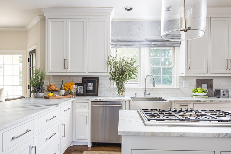
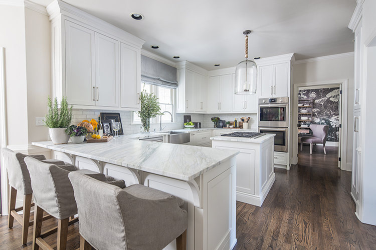
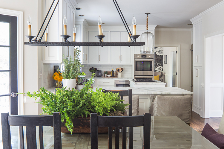
We kept the original footprint and ushered in clean lines with sleek cabinets and hardware. A fresh coat of snowy white helps the space reflect light and makes the space feel so much brighter.
Pro Tip: We removed the soffit and did a taller 48” high cabinet. This adds height to the space, while simple yet elegant moulding blends the cabinets seamlessly into the ceiling.

You know I can’t resist a lighting fixture that becomes a topic of conversation! We chose this glass pendant for its unique style, as well as the fact that we can see right through it. This creates a clear line of sight that keeps the space feeling airy and open.
Okay, let’s talk a little bit about these honed marble countertops. First, marble has been around a long time and will be around for a long time. (Just look at Europe’s centuries old marble structures for proof!)
Second, did you know you can always re-hone a marble top, but not re-polish a polished marble top? So while this client is good with the “love marks” that can occur with marble in the kitchen, there’s always the opportunity for a little touchup down the road.
Stunning? Timeless? Easy to touch up? Yes, please. 😉
How about another kitchen remodel tip? Elongated cabinet handles. Just taking that handle over 7” in length creates a fresh, streamlined look. This allows us to echo our theme of clean lines throughout the kitchen in different yet harmonious ways.
Subtle and sophisticated, this Ann Sacks subway tile backsplash gives the space another classic design touch. And not to be left out are all new appliances, a great faucet from Rohl, a Kohler stainless steel apron sink, and we haven’t even started cooking…

Lastly, we added some softness with comfy linen counter stools (that are always filled with guests!) and a linen Roman shade at the sink. And did you notice we hung those at the ceiling? This not only makes the ceilings look higher, but it also covers up those pesky arches that can give away the kitchen’s true age. The taupe and blue gray linens subtly mimic the veins of the marble…bringing its classic beauty front and center.

We believe in effortless style, timeless finishes, and creating a space where everyone feels at home…and this client was on board! In this case, a little investment went a long way, and we know they’ll continue to spend many happy years enjoying their new “home.”
If you’re ready to fall in love with your kitchen again, all you have to do is say yes. Reach out to us here, and we’ll help make all those #kitchengoals come true.
Xo,
Tara

Comments +